The Truth About Modern UI in SaaS: Why Your Users Care More Than You Think2
You’re staring at your SaaS dashboard, and something feels off. The functionality works perfectly, but users aren’t engaging the way you hoped. Sound familiar?
Here’s the reality: your users judge your software within 50 milliseconds of seeing it. That’s faster than you can blink. In those crucial moments, they’re not analysing your robust backend or evaluating your security protocols. They’re making gut decisions about whether your product feels trustworthy, professional, and worth their time.
But here’s where it gets tricky. You’ve probably heard conflicting advice about modern UI in SaaS. Some experts swear that sleek design is everything. Others insist that functionality trumps aesthetics every time. Who’s right?
The truth is more nuanced. Modern UI absolutely matters in SaaS, but not for the reasons you might think. It’s not just about looking pretty — it’s about creating an experience that builds trust, reduces friction, and helps your users succeed faster. Why Modern UI Has Become Non-Negotiable in SaaS
The Psychology Behind First Impressions
Think about the last time you walked into a restaurant. Did the cleanliness, lighting, and atmosphere influence your expectations about the food? Of course it did. Your SaaS interface works the same way.
When users encounter outdated UI elements. Think grey buttons from 2010 or cluttered navigation bars. Their brains automatically categorise your product as potentially unreliable. It’s not logical, but it’s human nature.
Research from Stanford University shows that 75% of users judge a company’s credibility based on visual design alone. In the SaaS world, where trust is everything, this statistic should make you pay attention.
The Competitive Landscape Has Changed
Remember when having any digital solution was impressive? Those days are gone. Today’s SaaS market is saturated with options. Users don’t just want software that works — they expect software that delights.
Your competitors understand this. They’re investing in frontend development services and partnering with SaaS UI/UX design agencies to create experiences that feel effortless. If your interface feels clunky by comparison, users will switch without a second thought.
Breaking Down the Three Pillars: Aesthetics, Usability, and Reliability
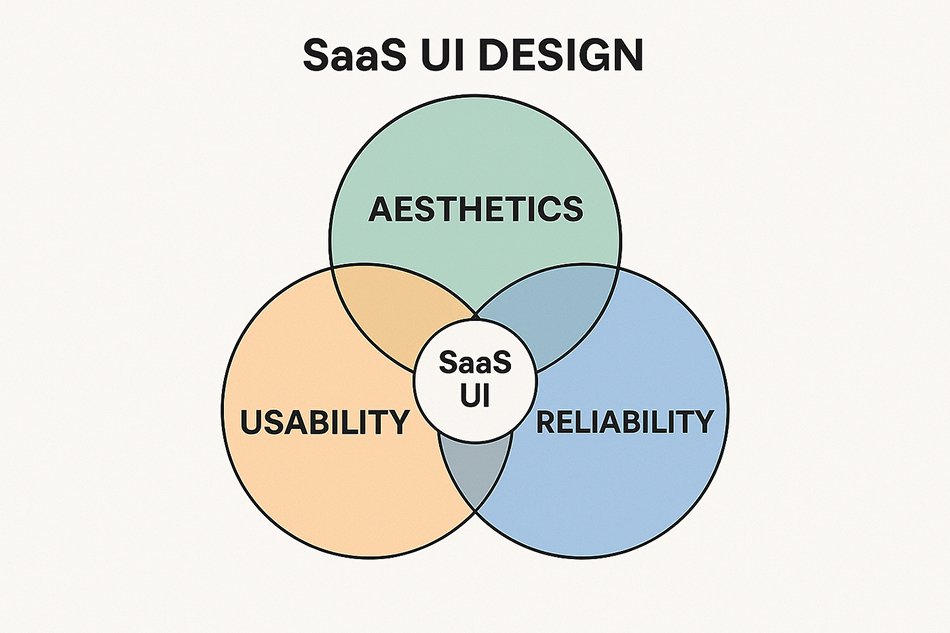
Aesthetics: More Than Just Pretty Colours
Modern aesthetics in SaaS isn’t about following the latest design trends. It’s about visual communication that supports user goals.
What Modern Aesthetics Actually Means:
- ✅ Clean layouts that reduce cognitive load
- ✅ Consistent typography that establishes hierarchy
- ✅ Purposeful colour schemes that guide user attention
- ✅ Thoughtful spacing that prevents overwhelm.
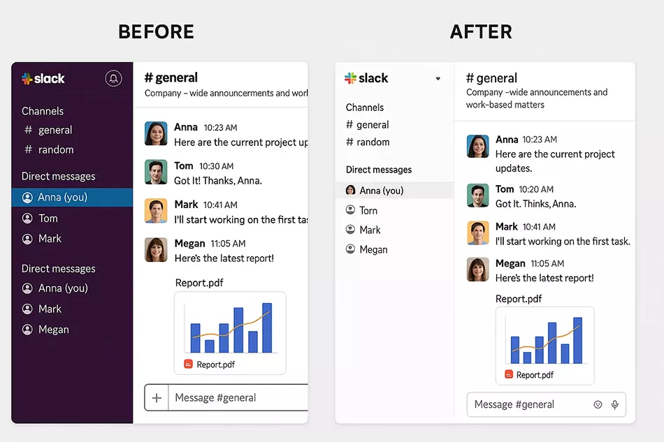
Consider Slack’s interface evolution. Their early versions were functional but visually dense. Their modern design uses plenty of white space, clear visual hierarchy, and consistent iconography. The result? Users can process information faster and feel less stressed while working.
Usability: The Foundation Everything Else Builds On
Here’s where many SaaS companies get it wrong. They focus so heavily on looking modern that they forget about usability. Beautiful interfaces that confuse users are worse than ugly interfaces that work well.
Key Usability Principles for SaaS:
- ✅ Progressive disclosure: Show users what they need, when they need it
- ✅ Familiar patterns: Don’t reinvent common interface elements
- ✅ Clear feedback: Let users know their actions had an impact
- ✅ Accessible design: Ensure your interface works for everyone
Take Notion as an example. Their interface feels modern and clean, but more importantly, it follows intuitive patterns. Creating a new page, organising content, and sharing documents all work exactly how users expect them to.
Reliability: The Trust Factor You Can’t Fake
Reliability in UI design means your interface consistently works as expected. This includes everything from loading states to error handling.
Reliability Manifests in:
- ✅ Consistent interactions across all features
- ✅ **Graceful error handling **that doesn’t break user flow
- ✅ Performance optimisation that prevents frustrating delays
- ✅ Cross-browser compatibility that works everywhere
When Figma handles network interruptions, they don’t just show an error message. They maintain your work, provide clear feedback about the connection status, and seamlessly sync once connectivity returns. This builds massive user confidence.
The Business Impact: Why Modern UI Affects Your Bottom Line
User Acquisition and First Impressions
You spend thousands of dollars driving traffic to your SaaS product. But if your signup flow looks outdated or confusing, you’re burning money. Studies show that improving first-run experiences can increase conversion rates by up to 25%.
Modern ui ux design services focus heavily on onboarding flows because they understand this connection. Every friction point in your initial user experience directly impacts your acquisition costs.
User Retention and Engagement
Here’s a counterintuitive truth: users don’t leave SaaS products because they lack features. They leave because using the product feels like work instead of progress.
Modern UI design reduces the mental effort required to accomplish tasks. When users can achieve their goals with less cognitive load, they naturally engage more frequently and deeply with your product.
Customer Support and Training Costs
Confusing interfaces generate support tickets. Complex workflows require extensive documentation. Inconsistent design patterns confuse new team members.
Companies that invest in thoughtful UI design report:
- ✅ 40% fewer support tickets related to usability issues
- ✅ 60% faster employee onboarding
- ✅ 35% reduction in training documentation needs
Common Misconceptions About Modern UI in SaaS
“Our Users Care More About Functionality”
This is the most dangerous misconception in SaaS. Yes, your users need functionality. But they also need to access that functionality efficiently.
Think about it this way: would you rather use a powerful car with a confusing dashboard, or a slightly less powerful car where every control makes intuitive sense? Most people choose the latter, and your SaaS users are no different.
“Modern Design is Just Following Trends”
Effective modern UI isn’t about following trends — it’s about applying proven psychological and usability principles. The reason certain design patterns become popular is that they work consistently across different user groups.
When user experience design services recommend flat design, generous spacing, or clear typography hierarchies, they’re not chasing trends. They’re applying research-backed approaches to human-computer interaction.
“We Can’t Afford to Redesign Everything”
You don’t need to rebuild your entire interface overnight. Smart SaaS companies approach UI modernisation incrementally.
Start with high-impact, low-effort improvements:
- ✅ Update your colour palette for better contrast and accessibility.
- ✅ Improve your typography hierarchy.
- ✅ Streamline your most common user workflows.
- ✅ Add loading states and better error handling.
How to Balance All Three Elements Effectively
Start With User Research, Not Visual Design
Before you hire a React.js development company or start redesigning interfaces, understand how your users actually interact with your product.
Essential research methods:
- ✅ User session recordings to see where people struggle
- ✅ Task-based usability testing to identify friction points
- ✅ User interviews to understand mental models
- ✅ Analytics review to find dropout points
This research will guide your priorities and prevent you from solving the wrong problems.
Prioritise Based on User Impact
Not every interface element deserves equal attention. Focus your modernisation efforts where they’ll create the biggest positive impact.
High-impact areas for most SaaS products:
- ✅ Onboarding flow — First impressions matter most
- ✅ Primary workflows — Where users spend most of their time
- ✅ Navigation structure — How users move between features
- ✅ Mobile responsiveness — Increasingly important for all user types
Choose Technology That Supports Your Goals
Your choice of frontend technology should align with your UI goals, not just developer preferences.
Framework considerations:
- ✅ Angular development services excel for complex, enterprise-focused applications.
- ✅ Vue.js development services offer gentle learning curves for smaller teams.
- ✅ React development provides maximum flexibility and community support
The key is choosing technology that enables rapid iteration and consistent experiences across your product.
Design Systems: Your Secret Weapon
A design system is like a style guide on steroids. It defines how every interface element should look and behave across your entire product.
Benefits of design systems:
- ✅ Consistency across all features and teams
- ✅ Faster development with reusable components
- ✅ Better maintenance with centralised updates
- ✅ Improved collaboration between designers and developers
Tools like Figma UI UX design make creating and maintaining design systems much easier than in the past.
Practical Steps to Improve Your SaaS UI Today
Quick Wins You Can Implement This Week
You don’t need to wait for a complete redesign to start improving your user experience.
Immediate improvements:
- ✅ Audit your error messages: Make them helpful, not technical.
- ✅ Review your button hierarchy: Ensure primary actions stand out.
- ✅ Check mobile usability: Test your key workflows on phones.
- ✅ Improve loading states: Show progress instead of blank screens.
- ✅ Update placeholder text: Make it instructive, not generic
Mid-Term Improvements (1–3 Months)
Strategic enhancements:
- ✅ Streamline your navigation: Remove rarely-used menu items.
- ✅ Optimise your onboarding: Focus on time-to-value
- ✅ Improve data visualisation: Make insights easier to understand
- ✅ Add contextual help: Provide guidance where users need it.
- ✅ Enhance keyboard shortcuts: Speed up power user workflows
Long-Term Strategic Improvements
Major initiatives worth considering:
- ✅ Complete design system implementation
- ✅ Comprehensive accessibility audit and improvements
- ✅ Advanced personalisation based on user behaviour
- ✅ Progressive web app capabilities
- ✅ Integrated user feedback and iteration systems
Working With Design and Development Teams
When to Hire External Help
Sometimes the most cost-effective approach is working with specialists who focus specifically on SaaS UI/UX challenges.
Consider external ux consulting services when:
- ✅ Your internal team lacks specific SaaS design experience.
- ✅ You need to move faster than your current resources allow
- ✅ You want an objective perspective on existing design challenges.
- ✅ You’re planning a major platform redesign.
Questions to Ask Potential Partners
For SaaS development agencies:
- ✅ How do you approach user research and validation?
- ✅ Can you show examples of similar SaaS projects?
- ✅ What’s your process for maintaining design consistency?
- ✅ How do you handle ongoing optimisation and iteration?
For developers (whether you hire AngularJS developers or other specialists):
- ✅ How do you ensure design fidelity during implementation?
- ✅ What’s your approach to performance optimisation?
- ✅ How do you handle responsive design requirements?
- ✅ What testing processes do you follow?
Measuring Success: KPIs That Actually Matter
User-Centric Metrics
Track metrics that reflect actual user experience, not just vanity numbers.
Key metrics to monitor:
- ✅ Task completion rates for primary user workflows
- ✅ Time to complete key actions (account setup, first project creation, etc.)
- ✅ Error rates and recovery success in critical flows
- ✅ User satisfaction scores for specific interface elements
- ✅ Feature adoption rates after UI improvements
Business Impact Metrics
Connect UI improvements to business outcomes your executives care about.
Business metrics to track:
- ✅ Customer acquisition cost changes after onboarding improvements
- ✅ User retention rates following major UI updates
- ✅ Support ticket volume for usability-related issues
- ✅ Expansion revenue is correlated with interface engagement
- ✅ Customer lifetime value trends
Future-Proofing Your SaaS UI
Emerging Trends Worth Watching
Stay aware of developments that might affect user expectations, but don’t chase every trend.
Trends with staying power:
- ✅ Voice interfaces for accessibility and efficiency.
- ✅ AI-powered personalisation that adapts to user behaviour
- ✅ Micro-interactions that provide better feedback
- ✅ Dark mode support for user preference accommodation
- ✅ Advanced data visualisation for complex insights
Building Adaptable Systems
Design your UI architecture to evolve with changing user needs and technological capabilities.
Future-proofing strategies:
- ✅ Component-based architecture that enables rapid updates
- ✅ API-driven interfaces that separate design from data.
- ✅ Modular design systems that scale with your product
- ✅ Regular user research cycles that catch changing preferences early
##Conclusion: Your Next Steps to Better SaaS UI
Modern UI in SaaS isn’t optional anymore — it’s a competitive necessity. But it’s not about following design trends or copying other products. It’s about creating experiences that help your users succeed with less effort and more confidence.
Start with these three actions this week:
- ✅ Audit your current onboarding flow — Record yourself completing your signup process and note every point of confusion.
- ✅ Ask five recent users about their first impression of your interface.
- ✅ Identify your top three user workflows and observe how people actually use them.
Remember, improving your SaaS UI is an investment, not an expense. Every hour users save, every frustration you eliminate, and every moment of delight you create builds toward stronger retention, better word-of-mouth, and sustainable growth.
The question isn’t whether modern UI matters in SaaS. The question is: how much is poor UI currently costing you in lost users, support overhead, and missed opportunities?